Project Information
An Experiment in Document Exploration
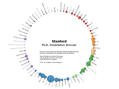
The Stanford Dissertation Browser is an experimental interface for document collections that enables richer interaction than search. Stanford's PhD dissertation abstracts from 1993-2008 are presented through the lens of a text model that distills high-level similarity and word usage patterns in the data. You'll see each Stanford department as a circle, colored by school and sized by the number of PhD students graduating from that department.
When you click a department, it becomes the focus of the browser and every other department moves to show its relative similarity to the centered department. The similarity scores are computed using a supervised mixture model based on Labeled LDA: every dissertation is taken as a weighted mixture of a unigram language model associated with every Stanford department. This lets us infer, that, say, dissertation X is 60% computer science, 20% physics, and so on. These scores are averaged within a department to compute department-level statistics (the similarities shown), and need not be symmetric. For instance, Economics dissertations at Stanford use more words from Political Science than vice versa. Essentially, the visualization shows word overlap between departments measured by letting the dissertations in one department borrow words from another department. Which departments borrow the most words from which others? The statistics are computed for each year in the data.
When you zoom in two-levels (click on a department twice), individual dissertations are plotted on a line between each dissertation's home department and its next highest scoring department, in proportion to how much that dissertation uses words from each of those two departments. The relative position of two dissertations is only meaningful when they are on the same radial line. Dissertations from other departments that have a high score for the central, focused department are also shown, colored. For instance, take a look at Computer Science in 2005. You'll see three dissertations along the radial line to Linguistics - those are the three students that graduated from the Stanford NLP group that year. There are plenty of other places you find similar things that work, and a few places that don't. In particular, small departments have less data and so are more susceptible to noise.
Our experience building this browser emphasized the ways that good interactive visualizations can improve text modeling, and vice versa. For instance, the visualization allowed us to experiment with many model variations (LDA, tf-idf, etc.) to see how well each matched our intuitions, and the contours of the models informed our choices in presentation. The model and visualization shown are our best so far, but both leave plenty of room for improvement.
The browser is build using Flare Visualization Library for Flash. Adobe Flash Player is required to view the browser.